

GED Testing Service
Study Page Redesign
Problem to be solved
The Study Page on app.GED.com is the gateway to students learning about GED study tools and one of our main revenue pathways, but we “hide” products and group them together in ways that are no longer aligned to our products (as we’ve grown the products we offer).
Current Study Page:
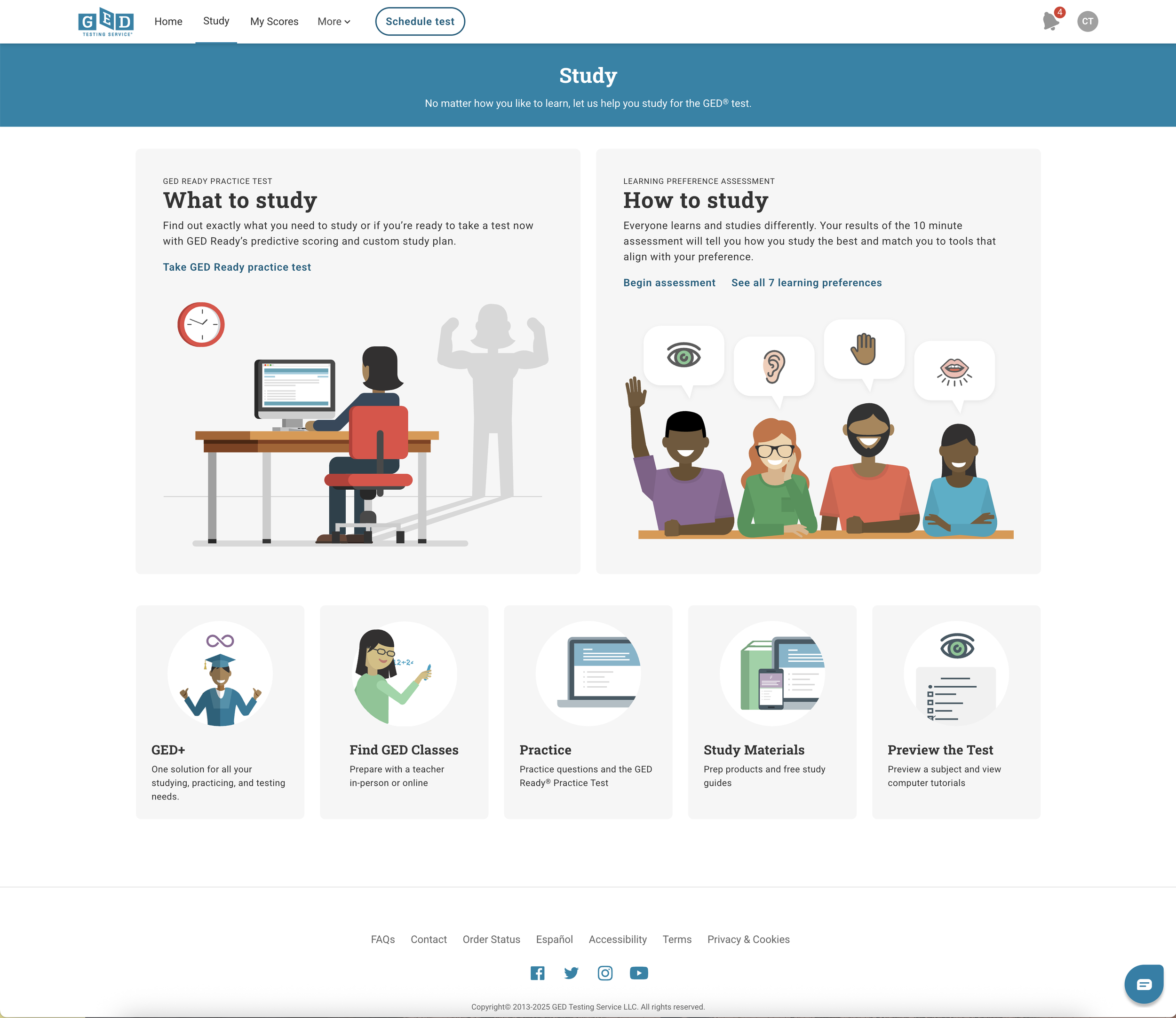
We only “expose” two of our products on this page: GED+ ($139, our most expensive product) and GED Ready (7.99, our least expensive product), and only GED+ has a standalone product page (similar to the public GED.com experience).
Because of these differences in presentation, the dev maintenance of these pages is high, and implementing promotions is unique for each product.
External User Feedback
-
Users want to be able to browse all of our products, not get "stuck" on a page with only *some* of our products.
-
Some users feel so confident they don't want to have to view all of the products before they can move on to the next step (taking a test).
Internal User Feedback
-
The teams that have to set up promotions for our products have different how-to steps for each product. Creating a more uniform experience would be nice to help them implement ad hoc promotions.
-
The promotion card that houses the CTA on the landing page of the portal is way down at the bottom (because this is the only one that can be used for ad hoc messaging); marketing teams want to know if our promotions can get a higher priority or exposure?
Solution
Redesign the Study Page, exposing all products (paid and free), while still supporting a “fast pass” option for those students that want to test right away, instead of studying.
If we update the study page to show all of the products we can:
Leverage a new study page format to also support standalone product pages for each of our products
Build a system to reduce dev churn for promotions, and
Create a uniform promotion set up experience for all other teams as well (marketing, store, QA, BA), etc.
Create a more consistent student experience
Start providing more clarity around which product is best for a student (and when)
Key improvements
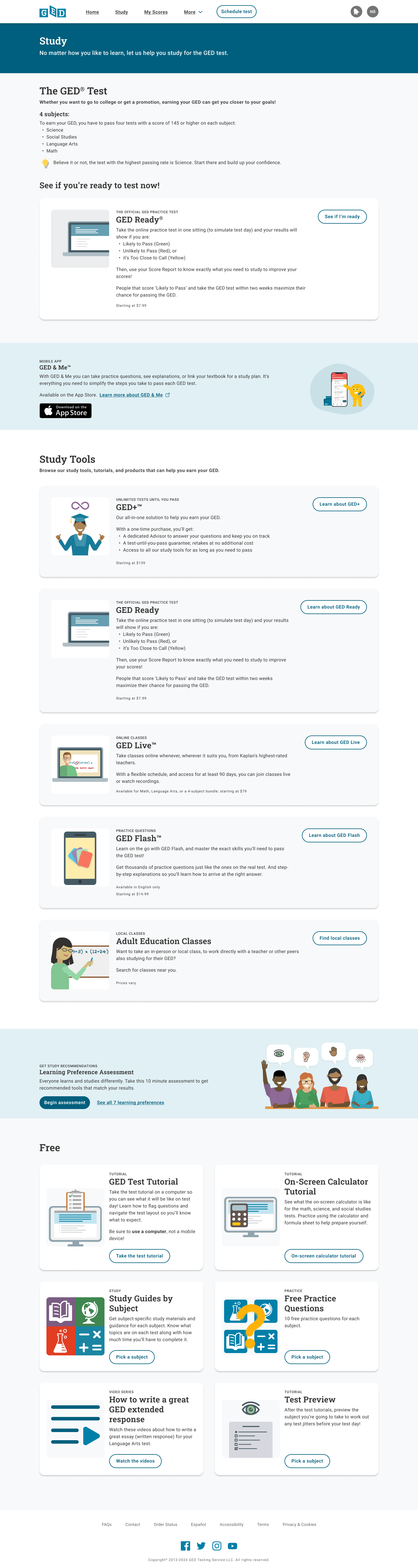
Implemented Page header component (improved contrast and accessibity)
Provide a short “outline” of the GED Test to help students understand there are four test subjects
Provide an option for students that are confident to skip studying entirely and just take a practice test (GED Ready) to “see if they’re ready”
A promotion section for GED & Me mobile app, another study tool for students
Expose all of our revenue-generating/vendor products in a single, scrollable page
Each product card allows us to:
Build product pages for each products
Provide a uniform promotional experience for every product
Show scannable highlights that can help users compare tools (pricing, available languages, etc.)
Update product illustrations throughout the portal and store to provide
A consistent user experience, and
Visual feedback for users to help them recall what they are purchasing/viewing.
A promotion section for a partnership learning evaluation that can help users understand which of our products will best support them based on how they learn
Expose all of our free resources up front, reducing clicks user needs to get to them
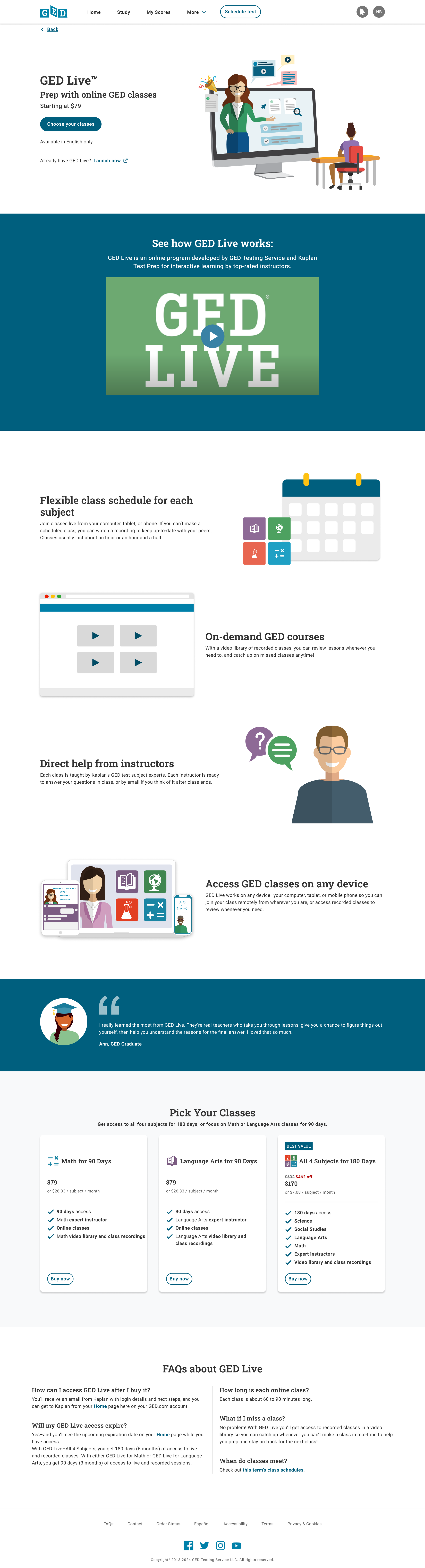
Benefits of building product pages
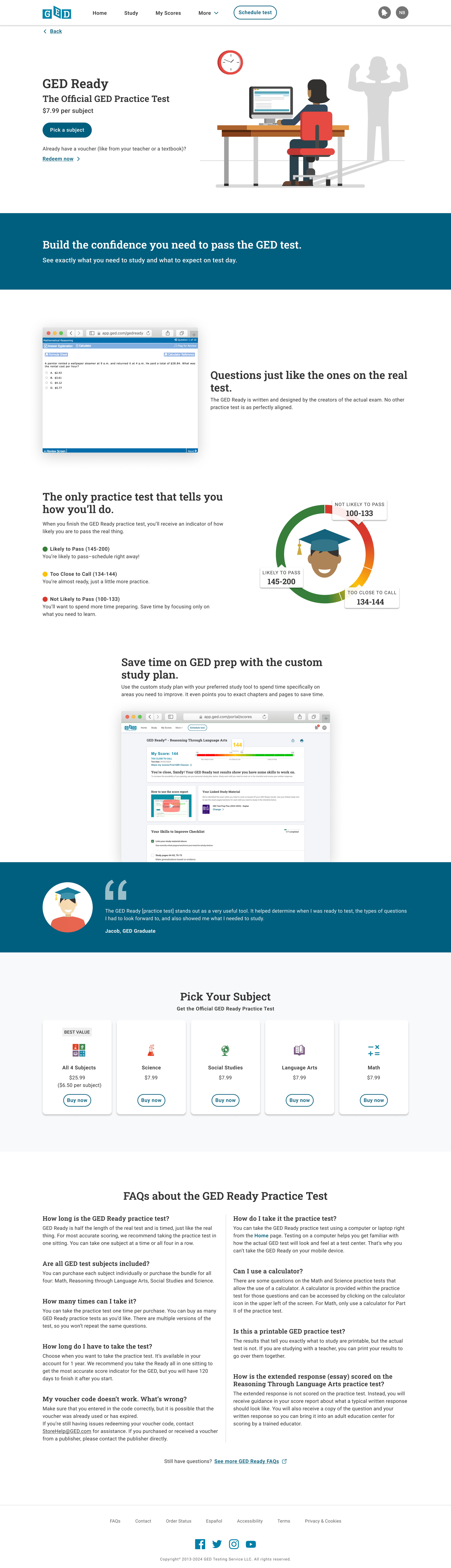
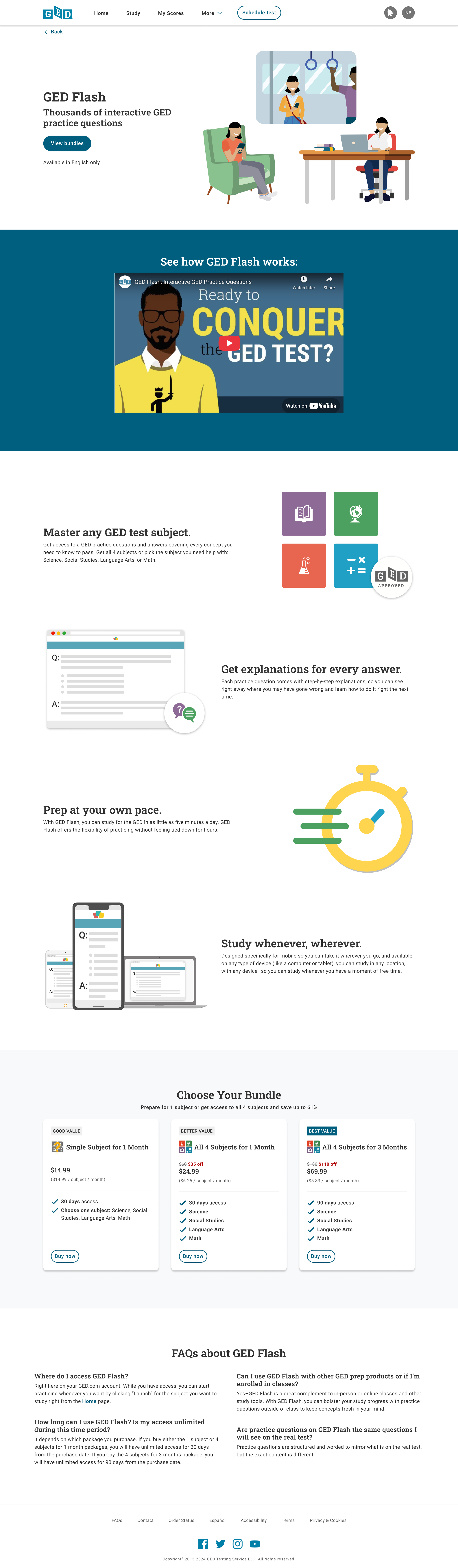
Adding standalone product pages provides:
A uniform experience for users that browsed our products on standalone product pages on our public site before logging in and want to continue viewing those product pages after they log in
A more accessible online experience, drawing from updated styles (colors, typography, etc)
A consistent promotional experience, that allows us to provide a clear “timeline” of every promotion
Implementing a uniform promotional experience, enabled BAs to launch promotions for any product with only content and configuration changes, and no development or QA hours
Reusing sections and elements like the hero section, product callouts, user quotes, and FAQs, provides a recurring and more consistent user experience across the GED portal
Promotions Experience and System:
The new study page, styles, and product pages allowed for a uniform system to be created to provide a robust, informative, and consistent promotional experience for users.
This helps the marketing team know what content to provide for a promotion and dev built a content configuration tool so that BAs can input all the data and copy needed for the user messaging and experience.
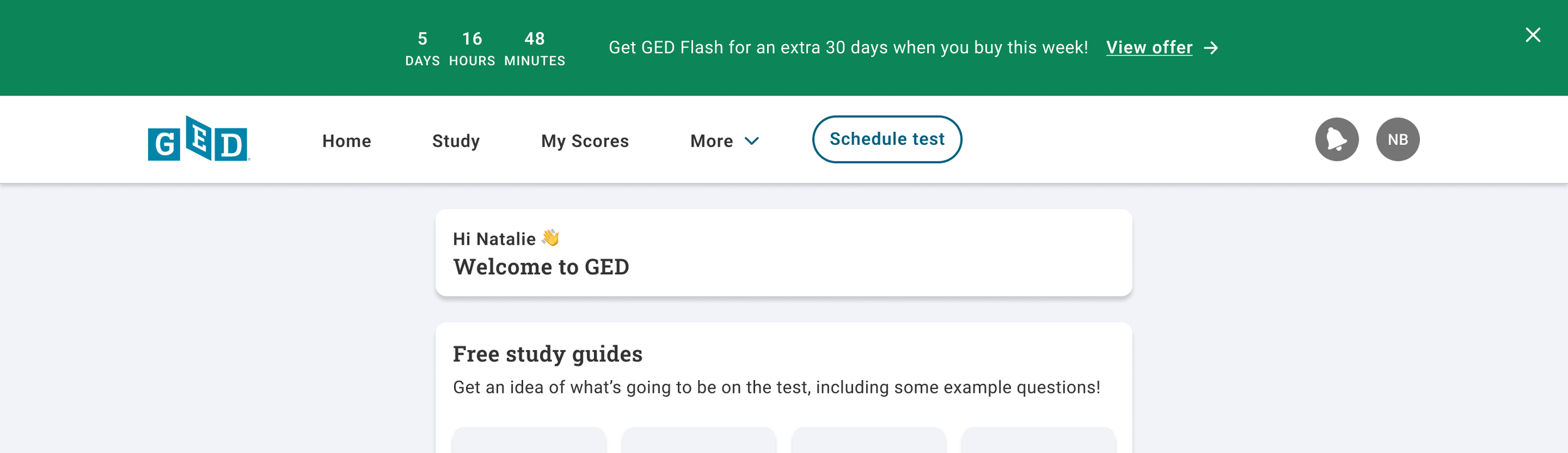
This green banner is sticky, showing on every page except the product that is on sale (which has different styling/promotional material).
It shows a live countdown of how long the promotional will last and links directly to the offering/product on sale.
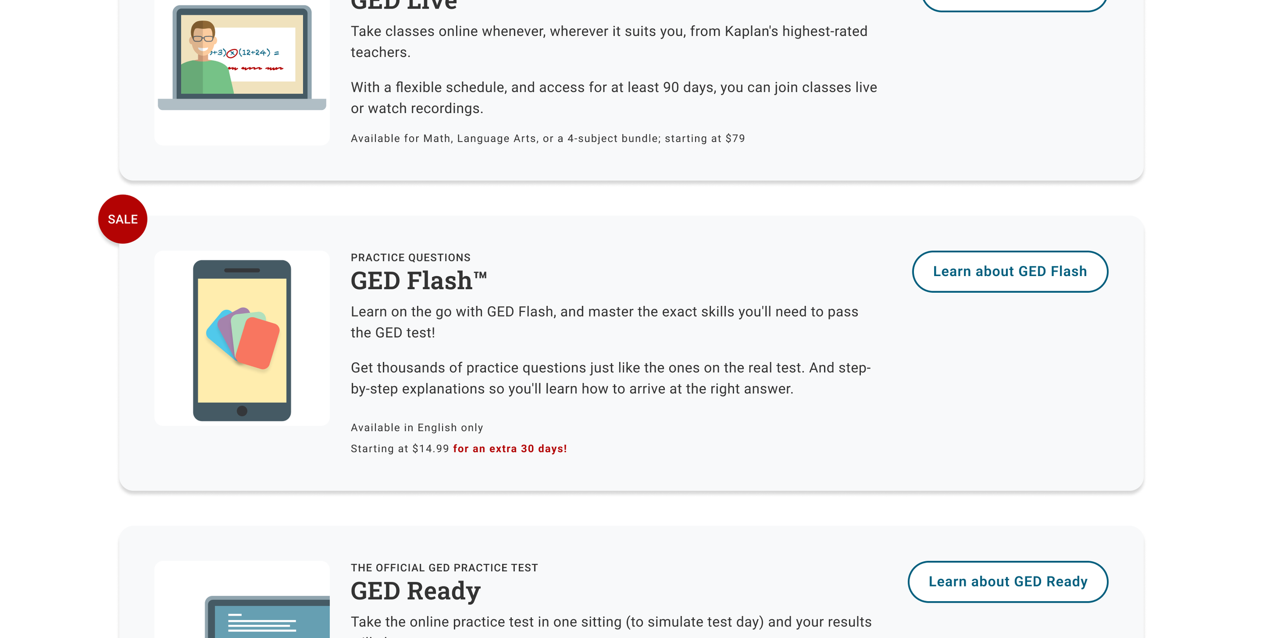
If the user ignores the promotional banner, we still present the promotion information on the study page, where the product is listed.
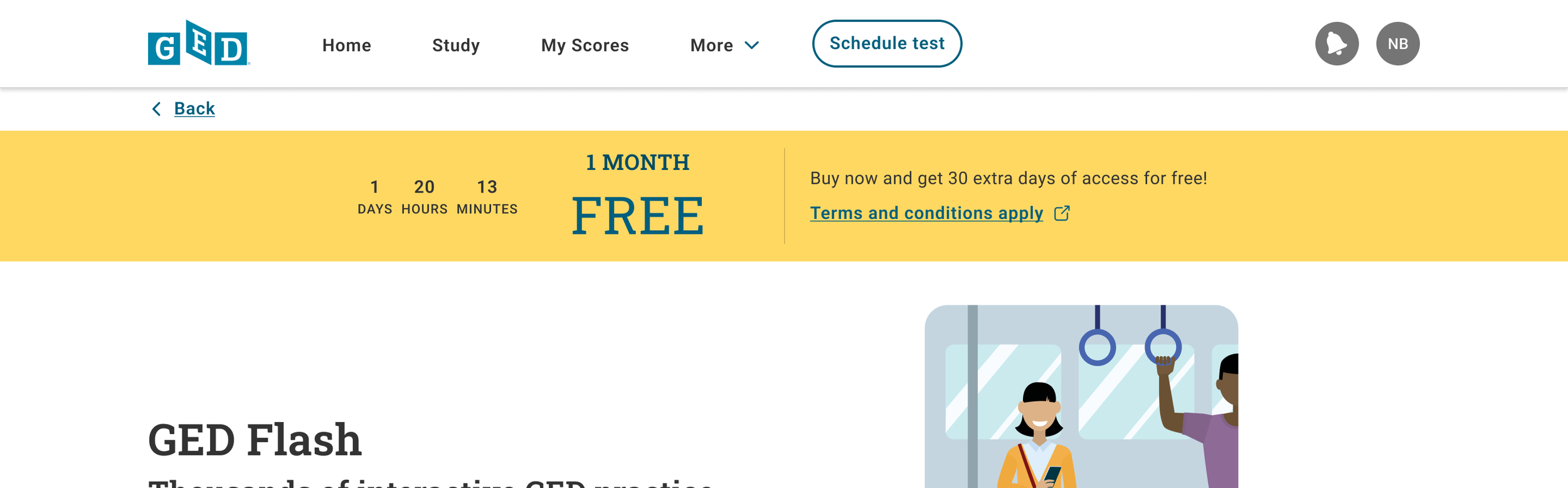
On the product page, the banner provides some additional context around the promotion, as well as linking to the offer’s terms and conditions page.
It also shows a live countdown of how long the promotional will last.
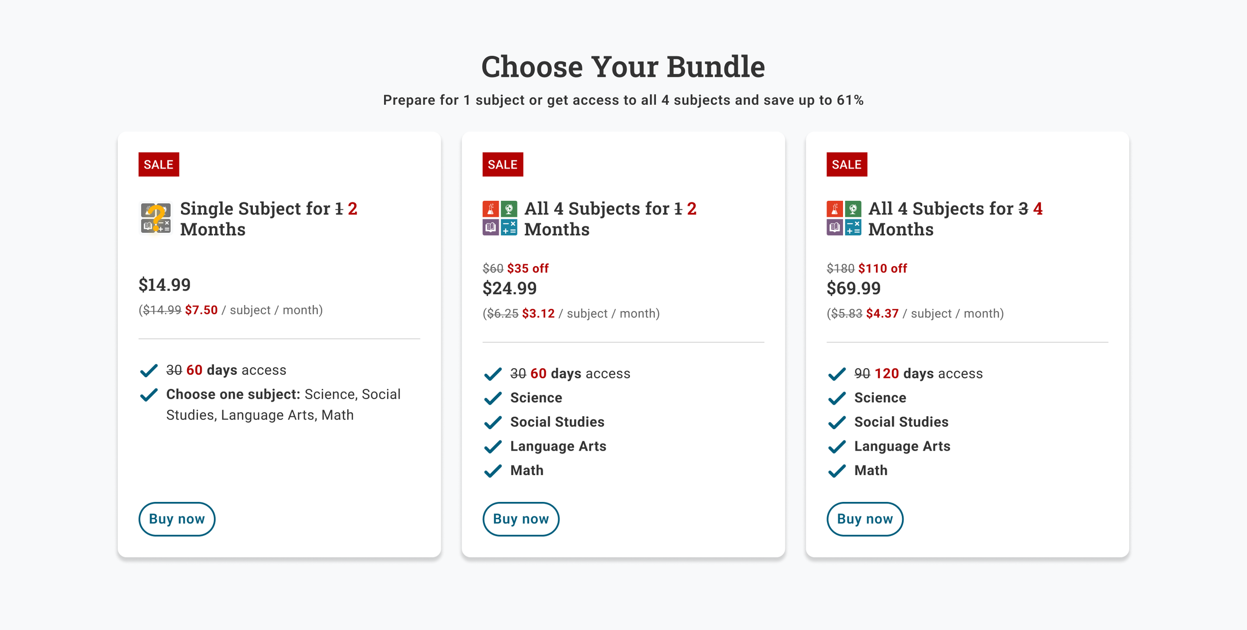
Each product on sale uses a few key visual indicators to reinforce the promotion being provided:
A red sale tag at the top of the description
Strike-through text for the promotional deal (in this case, the duration of your access, which also affects the price (per month))
“$ off” or similar deal information (e.g. 50% off, etc.) to explicitly state the cost benefit of the promotion
Product illustrations for “free tools”