MCAD Design Studio Summer 2024
Minnesota PWHL Branding
Problem to be solved
In 2023, the Professional Women’s Hockey League (PWHL) was started. In order to move swiftly into drafting players and starting the season, each of the original 6 teams were only designated a color and a name based on their location (e.g. Minnesota PWHL).
Market Research: Names and Mascots
-
61% (80/132) of mascots in professional leagues (the MLB, MLS, NBA, NFL, NHL, NWSL, and WNBA) do not directly match the name of the team.
-
28% (52/184) teams (from (MLB, MLS, NBA, NFL, NHL, NWSL, and the WNBA) have inconclusive mascot to name data (did not capture mascot, or the team is not currently named).
-
93% of NWSL team names are “things” or “concepts”, and 92% of WNBA team names are.
-
In the NHL, almost half (47%) of the teams are “things” or “concepts”, including the MN NHL team, the Minnesota Wild.
Naming
Final Name: Minnesota Superior
Ties to Lake Superior, as well as the concept of being great, or flying above others.
Team Mascot: Sophie Snipe (wetland bird)
To “snipe” in hockey means to shoot the puck accurately and swiftly into the net, usually hitting one of the top corners.
Design Round 1
Colors
I maintained a primary purple color, as it was the main identifying color for the MN PWHL team, but utilized Minnesota Wheat, the same buff color the Minnesota Wild uses, to reinforce the “Minnesota Sports Family” relation between the men’s and women’s professional hockey teams.
My main intention behind Round 1’s design decisions was to make the MN PWHL team and the MN NHL team feel like “sisters, not twins”–that they lived in the same family but were still visually different that you could identify one from the other, since these teams share a home arena.
This design direction was driven in large part by the relation between the men’s and women’s professional basketball teams in Minneapolis that also share a playing arena, the same colors, and the same background elements in their logos.
Logos
Continuing the trend of “sisters, not twins” and alignment with the men’s professional team, I sought to stay in the same style as the MN Wild logo (which uses a bear outline that corresponds to their mascot, and nature elements as filling pieces to convey the physical characteristics of a bear).
I created two logos that use an outline of a snipe and elements of nature that can be found in Northern Minnesota to create depth and convey the physical characteristics of the bird (a north star as an eye element, the lake to help outline the beak, and the cliffs and trees to help convey feathers and coloring patterns).
The secondary logo with the name surrounding the bird is aligned with the Minnesota Wild’s alternative logo, and uses a big dipper and North Star element to emphasize the arcs of the circle.
Jerseys
I included a home jersey (dark) with the primary logo as well as an alternative home jersey (with the secondary logo) and an away jersey (light).
Note:
In alignment with Molson (PWHL Montreal sponsor), the names of the players are placed below the number for improved visibility, as many elite women’s sports athletes have long hair.
Design Round 2
I received two critical pieces of feedback that caused me to adjust my designs:
Jaime Seebacher (the owner of @AllAreWelcomeHere, a Minnesota brand, which, among other things, sells shirts, tanks, and sweatshirts) noted that it may be hard to have consistent purple merchandise, especially with two different purple colors, and suggested a teal (or blue/green) color, as she sees the most consistent merchandise sales when she has a teal shirt.
Randal Hollis (a Product Designer at FreshForm.) noted that the nature elements in the logo were not reading as physical features of the bird and suggested that women’s professional sports are gaining popularity and visibility, and more often than not have their own style. He challenged me to push the logo and make it completely unique, as a way to show that the PWHL is a standalone, worthy, league to follow.
Logos
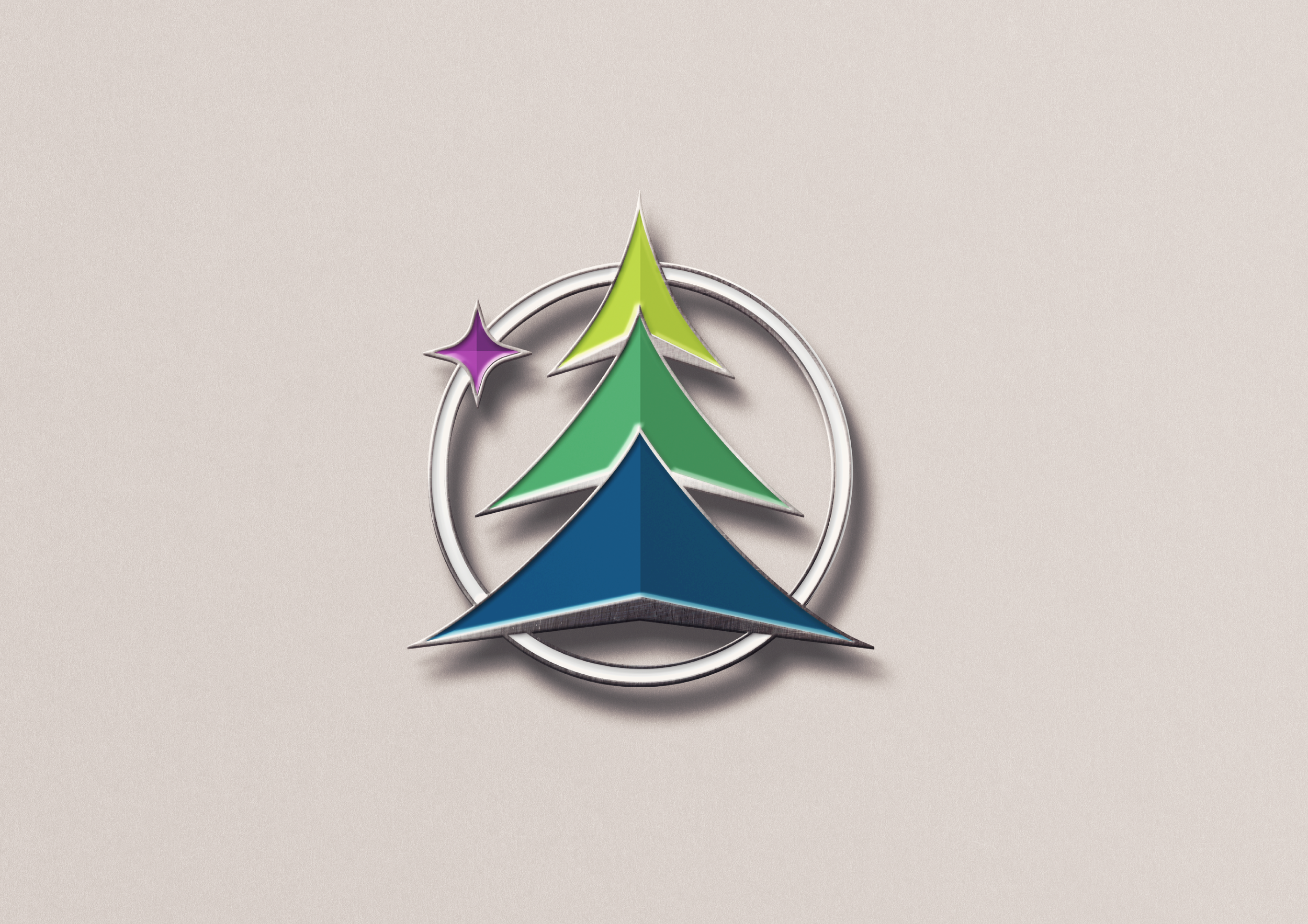
I started over, creating a more modern new logo based on ascending arrows (a nod to “Superior”) and some of the nature elements of the state (a tree, and the star is an ode to the north star).
The black and white logo will not be used in official documents and materials, but is available should a need arise.
Note:
The “Ice Blue” outline can be adjusted in partnership with special events, collaborations, or companies, e.g. Breast Cancer Awareness, or Pride Month.
Jerseys
Note:
The Away (light) jersey is a bit more traditional but the home jersey is more modern, utilizes every color in the palette and plays with ascending lines, as a nod to “Superior”.
Having a subdued jersey as well as a vibrant jersey will support the home and away league rules as well as allow audiences wider options for merchandising.
Market Research: An Argument for Merchandising
-
“Women’s sport fans are 25% more likely to buy sponsor products than men’s.”
-
“We found that when it comes to fan clothing for women’s sport, there is more demand than supply. . . . But in other cases, fans did not want to purchase what is supplied based on the style, fit and sizing. . . . When fans can purchase and wear their desired clothing, they feel they are contributing to the growth of women’s sport: ‘I truly believe that if more people see me or others wearing a jersey in support they will be intrigued enough to watch.’”
-
“Women’s elite sports are forecasted to generate more than $1B in revenue in 2024, a 300% increase in Deloitte’s evaluation of women’s elite sports in 2021.”
Merchandise


